Overview
Ponder is a web app for people who have busy lives and are looking to practice mindfulness for their well-being. The goal of this web app is to help users decrease stress, improve concentration, and lower anxiety through our venting and meditating features. Ponder allows users to set aside time for meditation and mindfulness even if it is just 5 minutes a day. I collaborated with a cross-functional team as a designer in an Agile environment, guiding our product through the entire 8-week cycle from planning to design, development, and shipping. I participated in a product design training program called Co.Lab, and this project was one of the assignments within the program.
UX/UI Designer
My Role
Timeline
8 weeks (Feb - Mar 2022)
Abe Noori (Project Manager) Matthew Wei (Developer)
Team
Problem Space
How might we help people with busy lives practice mindfulness?
My team and I wanted to focus on mental health and stress management. To foster overall well-being, it's crucial to cultivate healthy habits to combat stress. While mindfulness meditation offers numerous benefits, many individuals struggle to initiate the practice. Our aim is to provide users with a convenient solution for incorporating mindfulness into their busy lives, allowing them to find moments of peace amidst daily stress.
Features
1) Vent
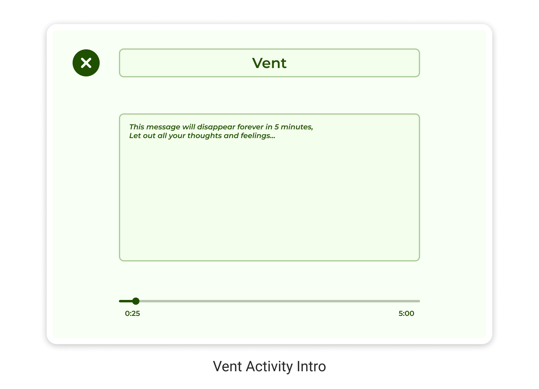
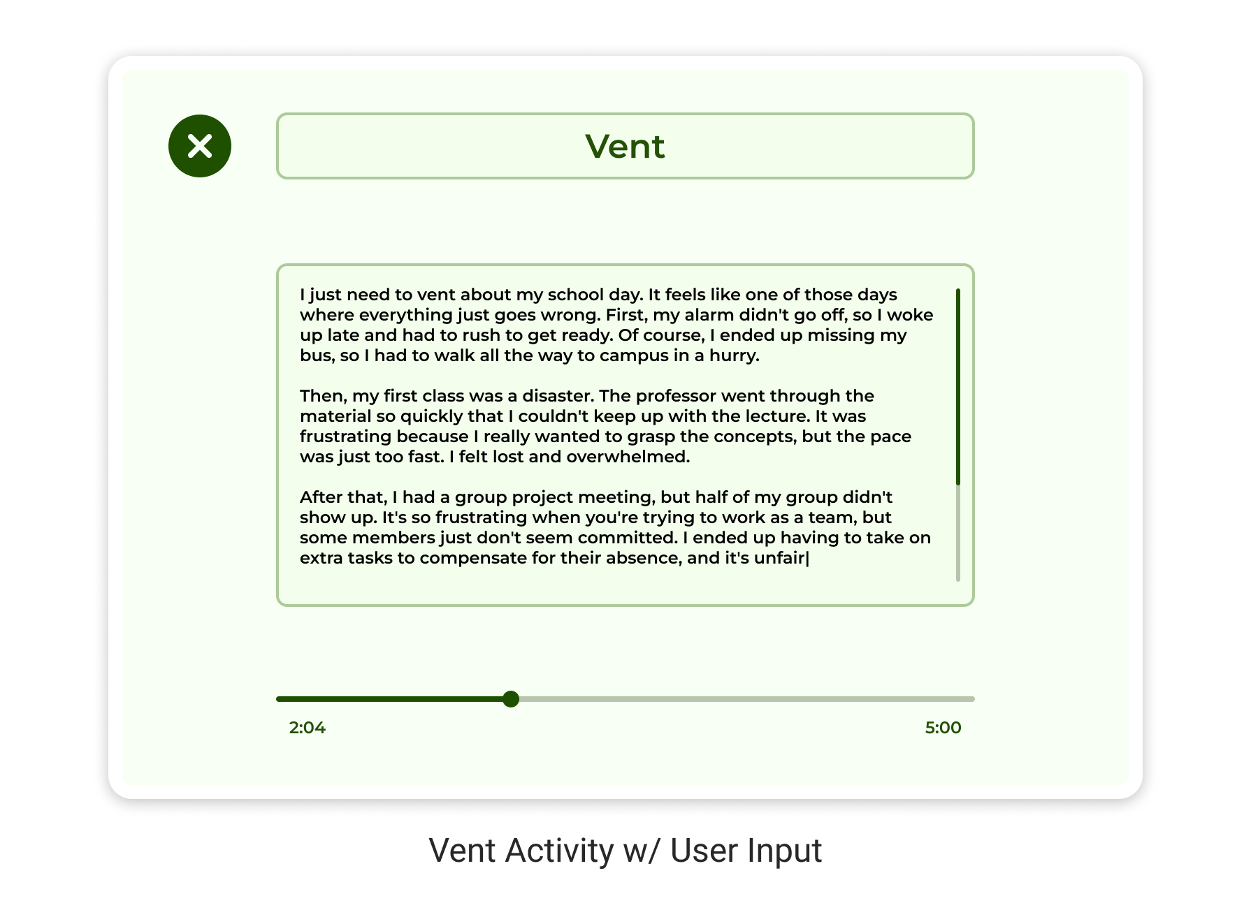
Write thoughts and feelings in a timed self-destruct message.
This feature enables users to release tension and freely express their thoughts and emotions through written text, providing a means of decompression. After their session ends, all messages are automatically deleted, ensuring privacy and leaving no trace behind.
2) Meditate
Practice meditation while listening to music.
This feature enables users to engage in timed mindfulness meditation sessions while enjoying soothing music. This activity is aimed at helping users achieve a state of mental clarity, emotional calmness, and stability.
User Research
We interviewed 5 participants in order to figure out how people cope with stress and practice mindfulness. The 5 participants we interviewed were either full-time students or full-time employees. We discovered …
60% feel stressed on a daily basis.
Preferred journaling to vent or write affirmations.
Users think journaling is a good way to decompress. Whether it was to write affirmations or to vent, journaling was regarded as a good exercise to help practice mindfulness.
Relied on deep breathing techniques to calm down.
We also found out that all users prefer to practice deep breathing techniques as a way to calm down and reduce stress.
Felt they didn’t have enough time to practice mindfulness.
All users were aware of the benefits of meditation but were not sure how to start meditating. All participants had busy schedules and only had a few minutes a day to practice mindfulness.
We surveyed 25 participants to better understand their coping habits.
At the end of our research, our team managed to validate the need for a time-efficient way to practice mindfulness and better understand the needs and pain points of our target user.
More than 50% were mainly stressed by work or school.
More than 50% prefer to listen to music to calm down.
Landing On The Solution
Based on our target users’ pain points, we knew we wanted to create a web application with the following features:
A way to allow users to vent without the repercussions of expressing their frustrations being held against them. As one user said, “When you say something you can’t take it back.” As a result of this finding, we decided on a feature that would allow users to write out their frustrations within a certain time period. After their session ends, the message is deleted without leaving a trace.
A way for users to practice heavy breathing or meditation. Most users preferred to practice heavy breathing while listening to music. As a result of this finding, we decided to also add a feature that would allow users to practice meditation accompanied by white noise in short and convenient sessions.
Due to time constraints, we could only prioritize these 2 features for our MVP.
Mapping the User Journey
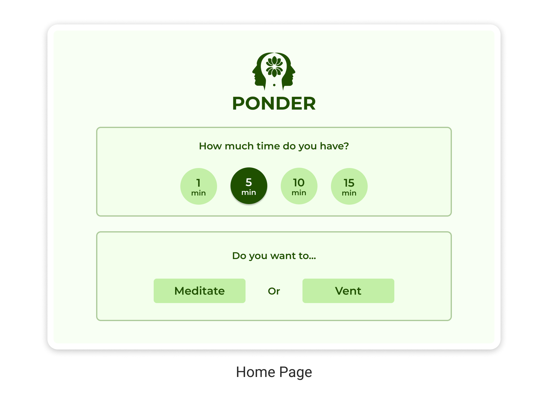
Before starting their mindfulness practice, users must decide on their available spare time and the specific activity they wish to engage in. To streamline the process, I designed the app to ask users these questions as soon as they arrive on the homepage, allowing them to get started in just two clicks. After each session ends, users are seamlessly redirected to the homepage where they can begin another activity.
User flow sketch
User flow diagram
Sketching out UI Variations
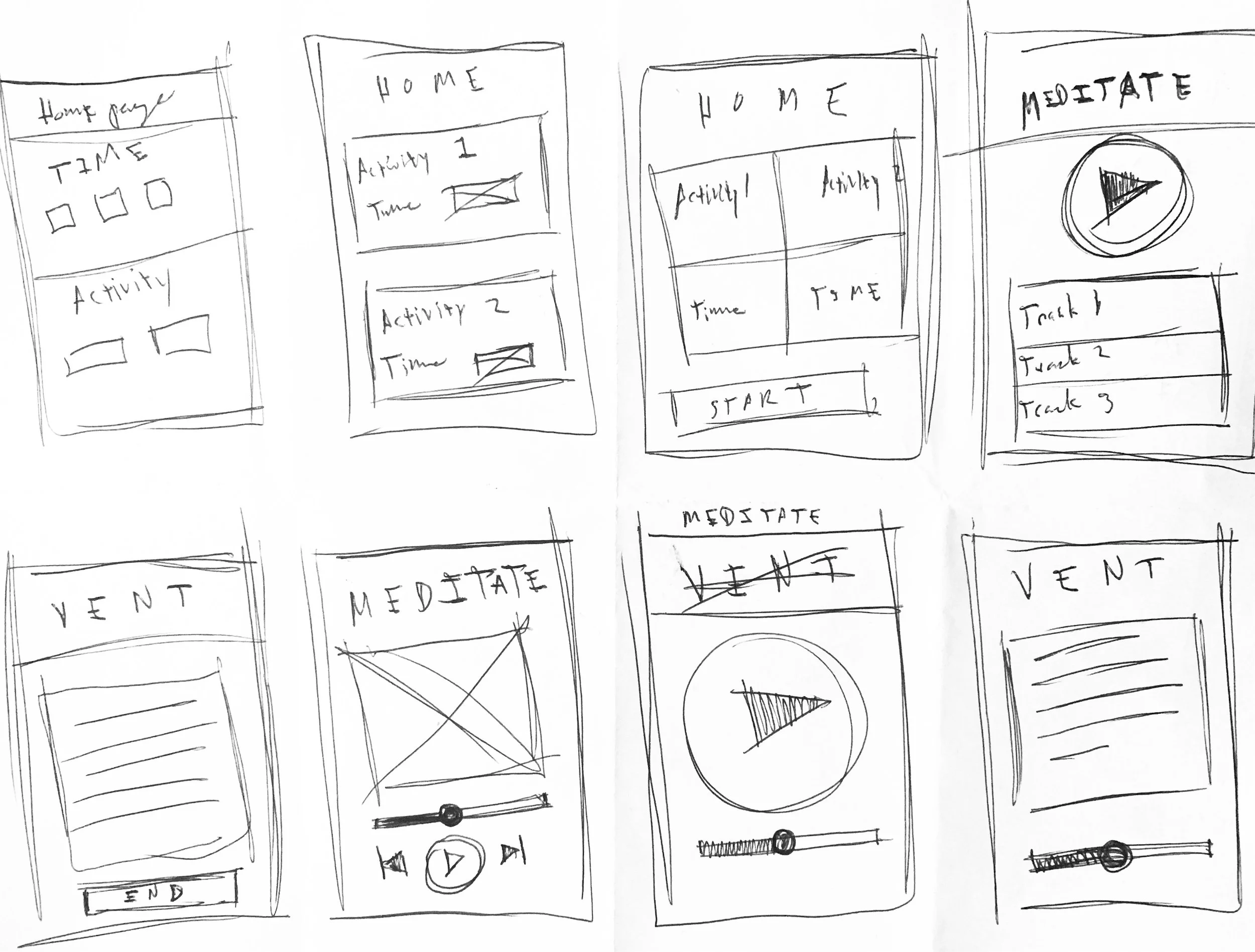
I began sketching wireframes to better visualize the functionality of each screen in the web app. To stay in line with the theme of minimalism, I wanted each screen to have as few focus points as possible. After a few iterations of Crazy 8's exercise, I was able to find ways in which users could complete each necessary task in as few screens as possible.
Crazy 8’s sketch exercise
Low-Fidelity Wireframes
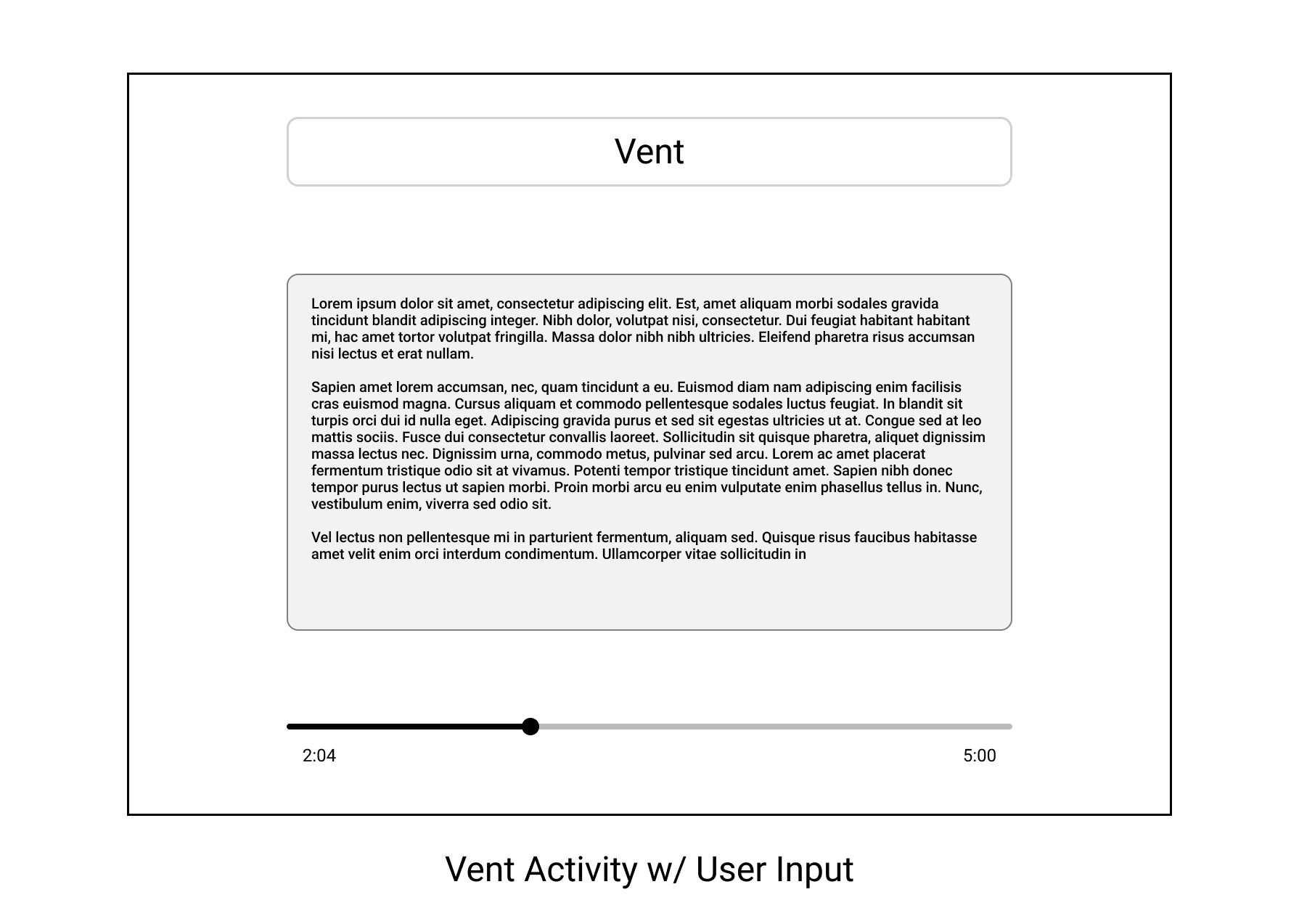
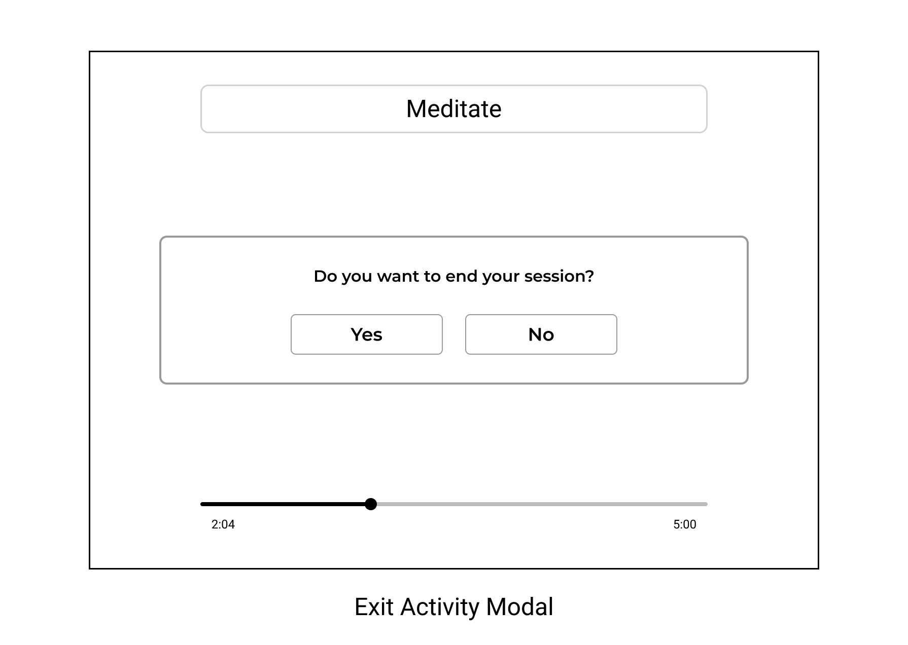
The ideas explored from my sketches became the blueprint for my low-fidelity wireframes. I chose a few sketches and further refined them with more detail in Figma. I began thinking about the appropriate layout of content and components.




Style Guide
Overall, I wanted the style of the UI to be minimal with lots of whitespace and an informal and casual vibe. This is why I chose a sans serif typeface and rounded shapes instead of shapes or typefaces that are more angular, sharp, and serious. As for the color palette, I went with tones of green because that color is commonly associated with the traits of health, wellness, growth, relaxation, and green tea!
Style explorations for Ponder UI
Finalized style guide
Wireframe progression from conceptual sketch to high-fidelity mockup
High-Fidelity Wireframes
After finalizing the direction of the style guide I was able to apply it to my high-fidelity mockups. These mockups served as a blueprint for the developer on our team to start building out the final iteration of our MVP. I met with the developer and PM where we went over specifics of how to create all aspects of the mockups.


Validating the Design Solution
I created a usability test to evaluate the app's navigation and identify areas for improvement.
I had 8 participants try to complete the tasks listed below:
1. Start a 1-minute meditation session
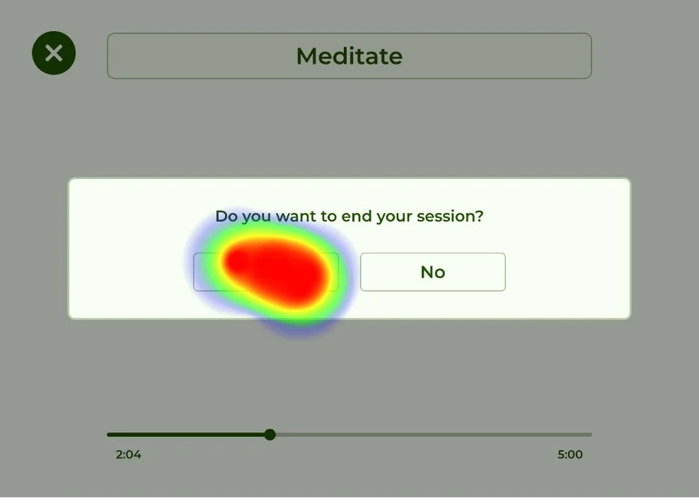
2. Exit the meditation session
3. Start a 5-minute venting session
Heat-maps from usability testing reveal that users were able to navigate the app with a 90% success rate
Prototype
Iterative Design Learnings
All 8 test participants were able to navigate the app with a 90% success rate without major confusion or hindrance.
Based on user feedback, we found the need to clarify when an activity session ended. Previously, users were automatically redirected to the homepage without explicit notification or guidance. As a result, I implemented a pop-up message that clearly indicates the end of a session and facilitates a smoother transition to the homepage.
New pop-up informs the user when their session is over
We created an MVP in 8 weeks!
At the end of our program, my team and I managed to launch an MVP in 8 weeks. I gained experience working within a cross-functional team and learned how to apply human-centered design principles with the creation of a web application. There were many times our team inevitably faced obstacles and we had to efficiently pivot and update our goals in order to provide a solution to our target audience.
Retrospective
1. Inclusion
I learned that involving cross-functional team members early into the design process can help generate better ideas and a better understanding of the constraints and feasibility behind design solutions.
2. Agile
Embracing agile methodology taught me how to develop and refine design solutions in a time-efficient manner, ensuring timely progress and adaptability throughout the project.
3. Developer Hand-off
This project taught me how a great hand-off can help developers better understand the design solution and lead to an efficient implementation.


